Design Combining Abbreviations (JT) With High-tech Symbols (eg Electronic Circuits Waves Or Dynamic
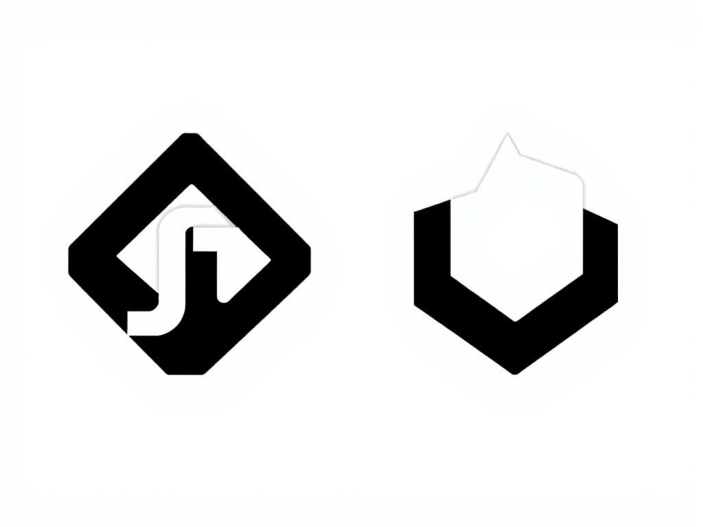
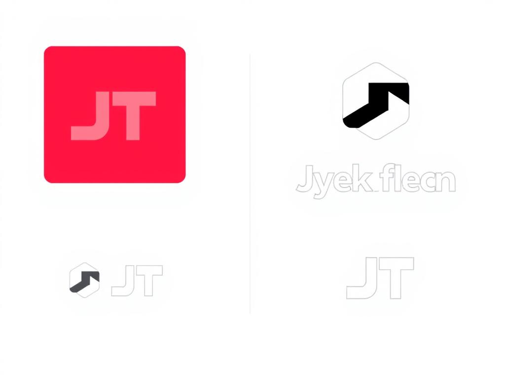
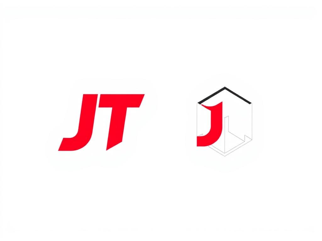
Design: Combining abbreviations (JT) with high-tech symbols (e.g., electronic circuits, waves, or dynamic shapes). The use of minimal geometric forms with sharp lines and smart negative spaces. 2. Color Palette: Main color: Royal crimson (#C8102E) for infusing luxury and energy. Monochrome: Black/white with reversible capability (e.g. black on white background or vice versa). 3. Typography: Modern Sanserif font (e.g. Gilroy, Futura) with bold semi-weight to induce professionalism. The possibility of merging symbols with letters (e.g., merging the dot "J" with an abstract shape). 4. Sample Ideas: Icon + Text: Jt ∈ Waveform/Orbit JT∈Waveform/Orbit Abstract Symbol: Combining minimal 3D branding (e.g., an opened cube) with the brand name. 5. Technical Features: Vector Design (SVG) for perfect capability. Horizontal/vertical versions for flexibility in packaging and web. 6. Inspiration from global brands: Fluid lines like Dyson + Philips minimalism + Tefal colorism. Visual Example (Description): The final logo can resemble a crimson cube with white lines lined with JANTECH letters diagonally placed next to it, with a uniform font and spacing.
19.07.2025 17:39