This Design Is Strong Confident And Makes The Name Itself The Hero It's Minimalist And Memorable
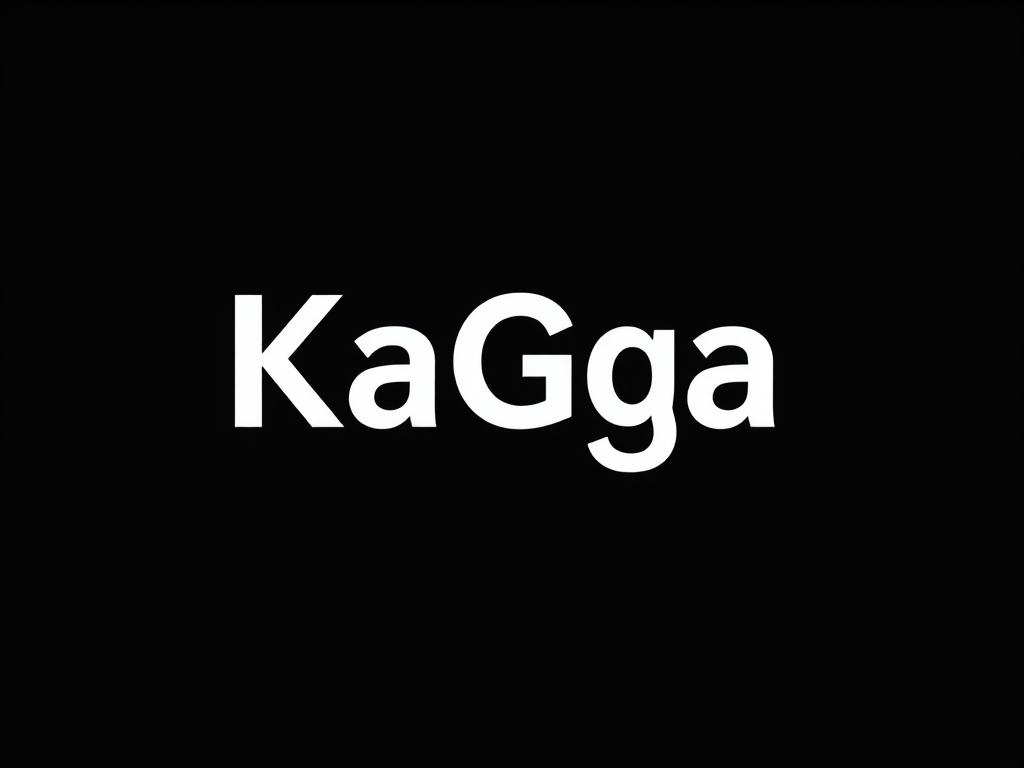
This design is strong, confident, and makes the name itself the hero. It's minimalist and memorable. · Logo Mark: The logo is purely typographic. The cleverness comes from the design of the text itself. The "ga" in "KaGa" could be seamlessly connected, or the dot over the "i" in (a hypothetical) capital "I" could be replaced with a simple geometric shape like a circle, square, or plus sign (+) to represent a "hub." · Typography: A strong, custom-altered serif or slab serif font (e.g., Rockwell, Roboto Slab, or a custom-drawn wordmark). The weight is heavy and the kerning (spacing between letters) is tight for impact. · Color Palette: · Primary: High-contrast and powerful. Jet Black + Bright White, or a deep Charcoal with a bold Crimson Red accent for the hub symbol. · Best For: Brands that want to project authority, strength, and a no-nonsense attitude. Great for finance, real estate, or high-end professional services. Visual Description: The words"KAGA" in large, heavy black letters, with the word "HUB" in smaller, but equally bold, capitals below it. The negative space between the "K" and "A" is perfectly balanced. The entire logo is a single, powerful block of text.
10.09.2025 00:40
Related Images